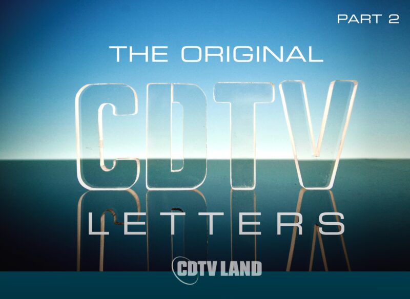

Part of the visual impact of the CDTV Title Screen is the captivating animation of the three rotating CDTV logos. You would be forgiven for thinking that this animation was made with 3D software. These letters were actually made by hand, then rotated and photographed, imported into an Amiga, cleaned up, and turned into the animation you see on the Title Screen and in the CDTV screen saver. Read on to learn about this intriguing piece of CDTV history!
The fact that the CDTV letters that you see spinning on the CDTV title screen are based on real physical letters has got to be one of the coolest pieces of CDTV trivia ever. In case you haven’t already, you can read more about how the iconic CDTV title screen came to be and how it works under the hood in a companion article I wrote here, which is where the subject of the CDTV letters was already briefly touched upon. But in this article the main focus is on the actual letters themselves, which also gives me the opportunity to include some more photos.

One of the three sets of original CDTV letters
The CDTV letters were created by artist Jim Sachs who was responsible for doing the user interface graphics and title screen for the CDTV operating system ROM. The shapes of the CDTV letters are based on the official CDTV logo and were cut from a thick sheet of plexiglass. Jim created the three sets of CDTV letters and then placed them in the shape of a triangle on a lazy Susan (a rotating plate). He then rotated the letters and made photographs of them which he later scanned and imported into the Amiga, where he cleaned everything up and combined the frames into the iconic rotating animation that we recognize from the CDTV title screen and the system default screen saver!
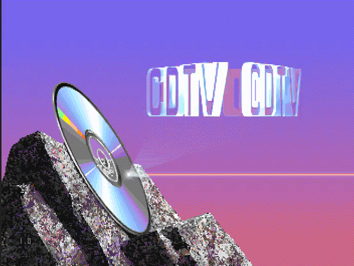
The CDTV title screen animation
Dimensions
CDTV Land is now the humble custodian of one of the three sets of CDTV letters, thanks to the generosity of Jim Sachs who chose to donate them. This allows us to take a closer look at the letters and see how stunning they are. (Really, the letters are so photogenic, you have to really make an effort to get a photo where they don’t look pretty).

Measurements of CDTV letters dimensions
The letters are 6.8cm tall (2.6″) and 1.1cm thick (0.43″). They are 3.8cm wide (1.5″), except for the letter V, which is 4.8cm wide (1.9″). As I mentioned above, Jim cut them from a big piece of plexiglass, but he did not use any fancy laser machinery or anything like that. The letters were cut by hand. As someone myself who can’t even cut a straight piece of paper to save his life, I can’t help feeling impressed by how well these letters came out.
IRRATIONAL ASPECTS
![]()
Due to the differences between NTSC and PAL, graphics that were designed for NTSC come out looking somewhat squished on PAL systems.[1] This is not so much of a problem for the general CDTV OS UI, but it is very noticeable with the CDTV logo which becomes distorted due to the different pixel aspect ratio in PAL.

On PAL displays the CDTV logo on both the title screen and the trademark screen is shorter than it’s supposed to be and comes out looking vertically squished. If you “grew up” seeing the CDTV logo on PAL systems, you may find the physical CDTV letters or the CDTV logo in the animation at the beginning of this article looking “stretched out”. But that is actually the logo in its correct aspect ratio as it was designed, as you can also clearly see on the packaging of CDTV titles and CDTV accessories.
![]()
This aspect ratio problem also exists on modern digital displays regardless of region, although it is less pronounced, because the deviation between the NTSC pixel aspect ratio and that of modern displays is smaller than the difference between NTSC and PAL.[2] ■
Outlines
A cool aspect of using plexiglass that works really well is that the sides of the letters, which is the part that was cut, comes out rough and loses its transparency. So you end up with objects that are transparent from the front and the back, but almost opaque from the sides.

CDTV letters
This gives the letters much needed definition in the form of an outline of sorts. After all, if they were fully transparent from all sides, they’d be barely visible. The photo above is a clear illustration of this, where you can see the light refract from the rough side surfaces. It is almost as if the letters emit light themselves, which makes them look so cool!
Effects
The transparency of the letters works great in creating the illusion of a hologram, which is the effect that Jim was going for, while it simultaneously increases the liveliness of the animation, because you can see the other letter sets in the background while the whole group of sets is rotating.
The glossiness of the plexiglass introduces another layer of interest which is the reflection of light in the faces of the letters. By strategically placing a light source, you can create some interesting reflections, as you can see from the first photo in this article. In the CDTV title screen animation this effect has been used to makes the face surface of the letters go from transparent to fully opaque in a rhythmical way.

Light reflection adds a layer of interest
You can see the light reflection come into view on the left with the letter C and then make its way from left to right until the angle is such again that the reflection is gone and the letters look transparent again.
Palette
Jim told me it was quite the challenge to get all the colors of the animation to look right, especially with the letters in the background shining through. And when you examine the CDTV letters animation frame by frame you come to appreciate why. You’ve got your transparent letter faces in the foreground, so the letters behind them will shine through. You then need to assign the correct color or mask for each pixel there, depending on whether it’s the back face of one of the letters behind which is visible, one of its sides, or just the backdrop of the screen.

Close up of a frame from the CDTV title screen animation
You also need to account for the aforementioned light source reflection which ebbs and flows and requires you to shift the color values up and down the brightness scale in tandem with this cadence to keep everything looking natural. Oh, and it all needs to work with a palette of 64 colors of which you only get to choose half![3]

The 64 color EHB palette Jim used for the CDTV title screen
Authentic Look
With 3D software on the Amiga still pretty much being in its infancy at the time, the choice to use physical plexiglass letters to create the CDTV logo animation was undoubtedly the right one (or even the only one depending on your perspective). You only have to look at the CDTV title screen animation to see why. By using stills of physical objects as a source and then transferring them into the digital domain and cleaning them up, a very authentic and natural looking effect was achieved for the rotating CDTV letters animation, which arguably would never have been achieved otherwise.
The human brain is very perceptive in picking up things that look “wrong”, fake or too sterile, and everything about the CDTV title screen animation just looks “right”, which is in no small part responsible for why it is one of the coolest looking startup screens of any home entertainment system from the twentieth century.
And it makes a great story too! ■

Notes
My deepest gratitude goes to Jim Sachs for donating the CDTV letters, but above all for his patience, his willingness to answer my nerdy questions, and for being such a nice guy. It was an honor meeting you, chatting with you, and receiving this super cool artifact of CDTV history from you in person, Jim!
– Mijo
- Digital content for NTSC has a pixel aspect ratio of 1:0.906. This means that pixels should not be displayed perfectly square, but a little taller than they are wide. On PAL on the other hand the pixel aspect ratio is 1:1.094, which means pixels are displayed a little wider than they are tall. So if you draw a perfect circle for NTSC, it comes out looking squished vertically on PAL. If you draw a perfect circle on PAL, it comes out looking vertically stretched on NTSC. ↩
- Digital displays, regardless of country, all have the same 1:1 pixel aspect ratio. So the aspect ratio problem has been solved going forward. However, displaying Amiga graphics on modern displays now results in distortion for both PAL and NTSC, since neither match. The CDTV logo will still look squished on digital displays, although less so than when displaying it on a PAL system. Note that many Amiga emulators do have options to correct the pixel aspect ratio. ↩
- The CDTV title screen uses the Amiga’s Extra Half-Brite mode. Even though the Amiga’s original chip set hardware only has 32 color registers, the Extra Half-Brite mode doubles the maximum number of colors from 32 to 64. The only trade off is that you can’t directly specify the additional 32 colors. Instead, they are based on the first 32 colors but are half the intensity (brightness) of those colors, i.e. a darker copy. ↩